New year, new decoration color!
Each year, the most internationally reputed color institutes reveal the colors that will inspire deco trends throughout the year. These colors influence fashion as well as product conceptions. In fact, I’d say that trends in decoration are first influenced by dress fashion! Remember; when we started seeing velvet jackets in clothes store, well then it was velvet in home decoration that did its entry, we want velvet window dressings, velvet sofas and even velvet bed-covers!
The most important group that influences interior decoration and interior designers in their creations is definitely Pantone. The color choice is audacious, so depending on your deco project or your personality, it is better to use it in small dose, otherwise ask for the advice of an interior designer if needed.
The 2019 color according to Pantone is Living Coral 16-1546
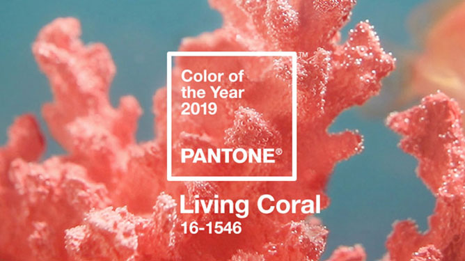
Here is this color’s description:
‘’ Vibrant, yet mellow PANTONE 16-1546 Living Coral embraces us with warmth and nourishment to provide comfort and buoyancy in our continually shifting environment.
In reaction to the onslaught of digital technology and social media increasingly embedding into daily life, we are seeking authentic and immersive experiences that enable connection and intimacy. Sociable and spirited, the engaging nature of PANTONE 16-1546 Living Coral welcomes and encourages lighthearted activity. Symbolizing our innate need for optimism and joyful pursuits, PANTONE 16-1546 Living Coral embodies our desire for playful expression.
Representing the fusion of modern life, PANTONE Living Coral is a nurturing color that appears in our natural surroundings and at the same time, displays a lively presence within social media.’’
Here are some ideas to incorporate this color in your decoration projects:
-Use it as wallpaper.
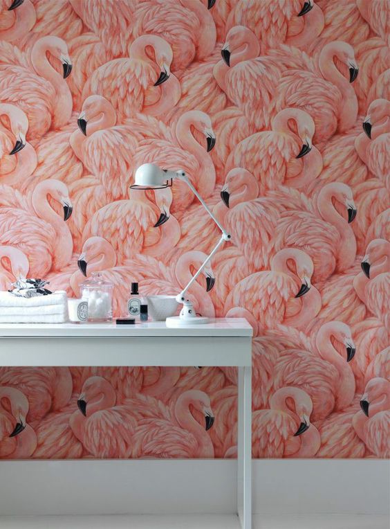
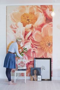
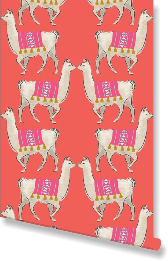
-Create an accent wall.
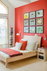
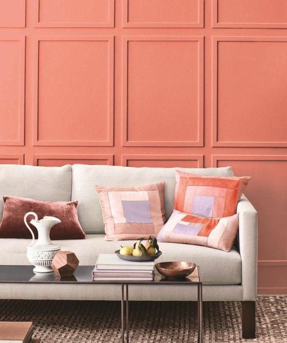
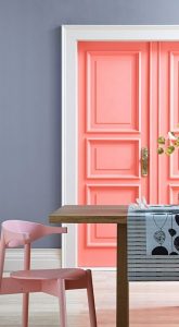
-Add touches of color in your deco (armchair, dishes, lamp, cushion)
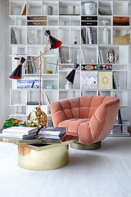
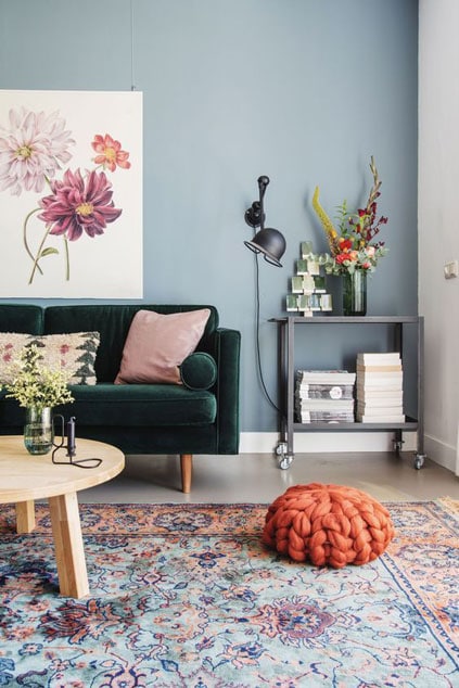
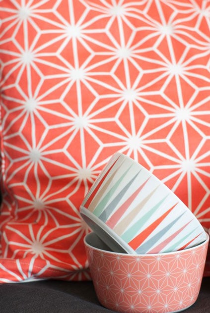
We should still take trends lightly and if coral isn’t for you, read this article to know how to choose well a color in decoration.
For example, a great leader in the field of Residential paint, Benjamin Moore, also has his trend team to define trends in decoration. This year, they came to the conclusion that the color of the year 2019 is Metropolitan AF-690.
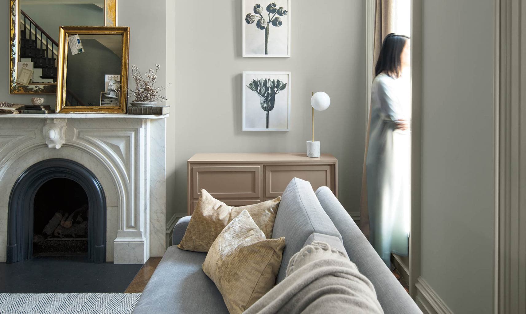
“Metropolitan AF-690 emanates nuance, harmony and extravagant ease. Always adaptable, it softens to matte or shimmers with sheen. It’s neutral. It’s composed. It just is. This is colour, off-duty.”
It is such a difference with Pantone! This is explained by the fact that in interior design we use neutral colors as base and we arrange them with accent colors! So there is a panoply of trendy colors in 2019! We move away a little bit from neutral grays to go towards a bit warmer and richer tones.
Interior designers and architects use a lot the colors of the year named by Pantone, Benjamin Moore, Sico, etc. in their decor and project creations.
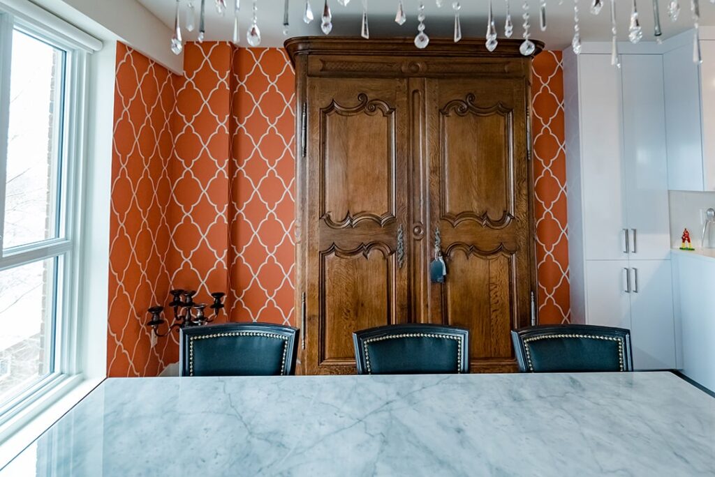
For my part, I did a project a few months ago in which I used the color Coral as an accenteven before it was named color of the year 2019! As a matter of fact, it is mostly a crush from my client that made us choose this wallpaper.
In the end, I’m listening to my clients because my goal is to create a decor that fits your image to give you the most well-being daily, according to your needs and your lifestyle. Because I deeply believe that everyone deserves a home that looks like them and where it feels good to live.
To conclude, there isn’t only one color of the year, but 2019 is your year. So create a setting that reflects who you are!
