Have you ever bought a gallon of paint only to be disappointed with the color once you’ve applied it?
You therefore have lost time and money. It remains to be seen whether you have the courage to start all over again! Maybe you decided to leave it like that and today you’re determined to repaint your wall, but you don’t want to make a mistake.
With my pro tips, you’ll have every chance of making the perfect color selection!
First, remember that the color you choose will look more vibrant on the wall than on the cardboard. If you want a yellow and like a cardboard color, choose a hue a little more saturated than you thought you wanted.
Then, the color should be chosen according to the room where she’ll be applied. Lighting and present elements in a room influence our perception of the color. Test the cardboard color at different moments of the day to make sure that the result wouldn’t be too dark.
If you’re still not 100% sure of your choice, pick up a sample of the paint at the store for about ten dollars and apply it to the wall to see the results!
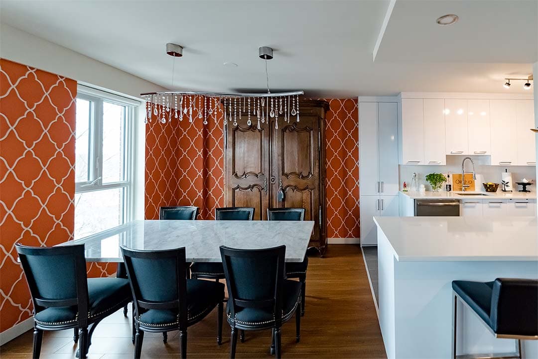
Now here’s the three-color rule: a very practical rule for design fanatics who want to paint the whole house. It concerns the decoration of a house’s living space (entry, living room, kitchen, dining room and halls). This principle will give you a guiding line. The idea is to choose three well paired colors to use in the whole decor.
The first tint is the base color. It will be the most present. Therefore, I suggest a neutral and light color such as off white or pale gray.
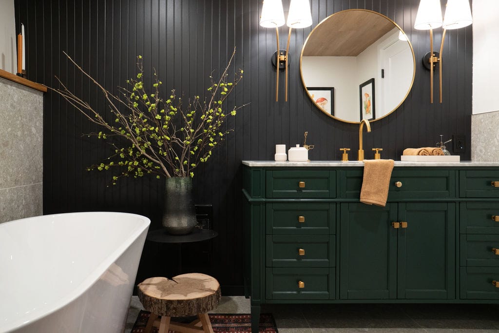
The second color can be richer and darker. She can be on furniture, decorative accessories, etc.
Finally, the third color is the ”punch” tint. It must be present in little amount. For example, on an accent wall or in the living room carpet. Repeat this color in several rooms, and don’t hesitate to choose a bold shade.
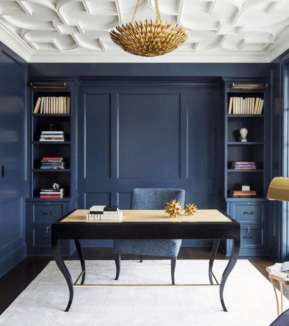
Beware: colors have an impact on our behavior.
In fact, warm and cold colors activate different parts of our brain.
To create a relaxing ambience, use cold blue. It is a color that has soothing properties and helps with concentration. It’s an ideal color for an office.
Warm colors will stimulate our metabolism, so it isn’t a good idea to paint a bedroom in white since it isn’t suitable for peaceful rest.
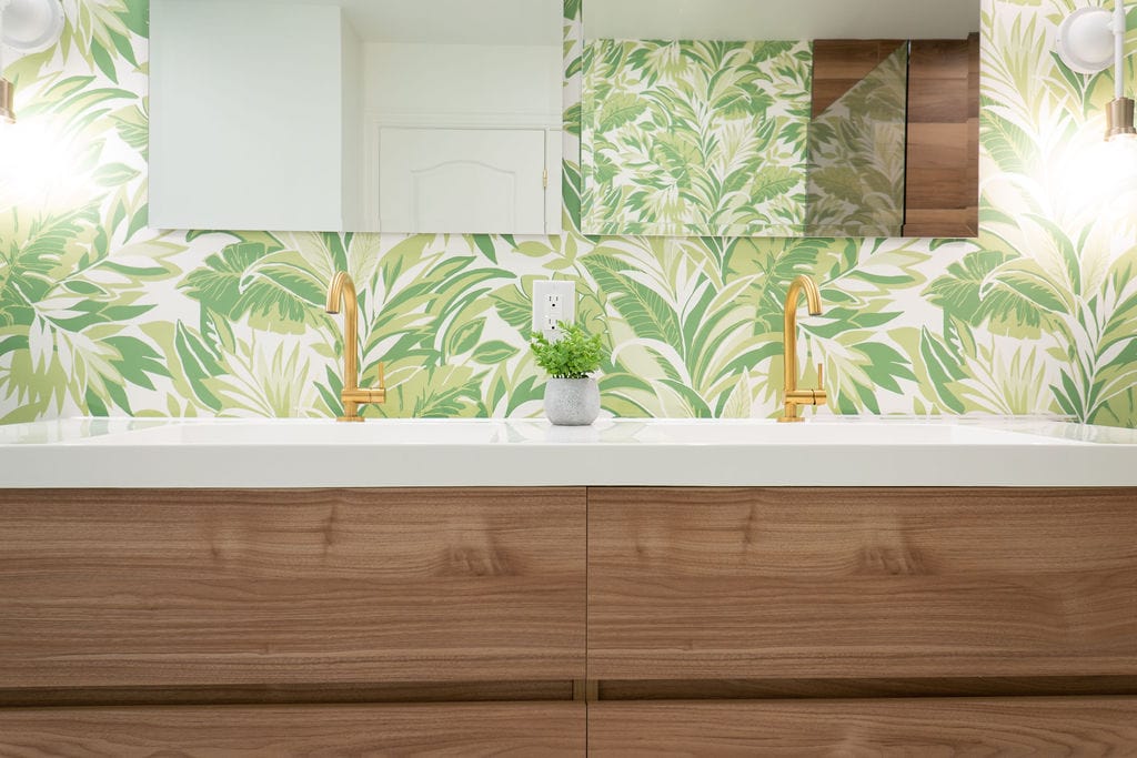
You can use warm colors in living spaces such as the kitchen, dining room or living room!