
The world of fashion and the world of decoration are very connected when it comes to the trends of the year. In 2020, we saw a movement to get back to basics, to the simple elements of life and the slack-chic trend emerged! In 2021, people are looking for settings that are in line with this. We will see scenery influenced by nature.
Each year, the most internationally reputed color institutes reveal the colors that will inspire deco trends throughout the year. I present them to you here.
The most important group that influences interior decoration and interior designers in their creations is definitely Pantone. The color choice is audacious, so depending on your deco project or your personality, it is better to use it in small dose, otherwise ask for the advice of an interior designer if needed.
The 2019 color according to Pantone is Living Coral 16-1546
Here is the description of this color harmony:
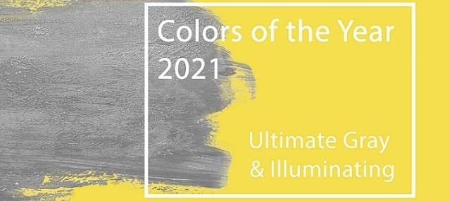
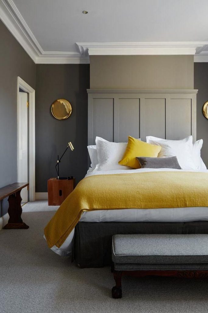
Two independent colors that highlight how the different elements work together to support each other, best express the color trend of the year Pantone 2021. Practical and unwavering, yet warm and optimistic, the union of PANTONE 17-5104 Ultimate Gray + PANTONE 13-0647 Illuminating brings strength and positivity together. The story of a color that encompasses deep, delicate feelings with the promise of a sunny, benevolent future.
A message of fearless happiness, the ambitious union of PANTONE 17-5104 Ultimate Gray + PANTONE 13-0647 Illuminating is synonymous with hope. We need to feel that everything will become clear; this is essential to the human spirit.
As we all seek ways to strengthen ourselves with energy, clarity and hope in the face of ongoing uncertainty, playful and uplifting shades answer our quest for vitality. PANTONE 13-0647 Illuminating is a bright, cheerful yellow that’s full of vitality, a warm shade with a sunny power. PANTONE 17-5104 Ultimate Gray represents the reliable, unwavering, eternal elements that provide a solid foundation. Like the colors of pebbles on the beach and natural elements whose weathered appearance underscores their resistance to the test of time, Ultimate Gray quietly reassures by encouraging feelings of serenity, stability and resilience.
Source Pantone
Here are some ideas to incorporate this color in your decoration projects:
-Use it as wallpaper.
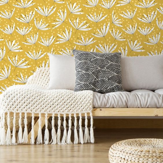
-Create an accent wall.
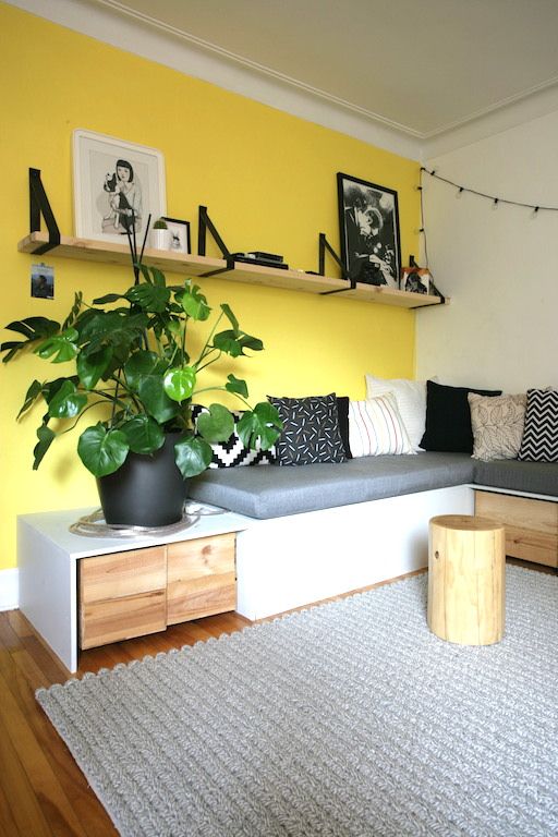
-Add touches of color in your deco (armchair, dishes, lamp, cushion)
Still, fashions should be taken lightly and if yellow and gray are not for you, read this article on how to properly choose a color in decorating.
On another note, Benjamin Moore, a leader in the residential painting industry, also has a trend team to set the trends in decorating. This year they have come to the conclusion that the color of the year is the antique green 2136-40
Here is this color’s description:
Take time to meditate and recharge your batteries. Intriguing, balanced and deeply soothing, Benjamin Moore’s color of the year 2021, Antique Green 2136-40 creates a natural harmony.
Enjoy the little pleasures – the soft rustle of old linen sheets in the morning or the smell of perfectly ripe fruit on the windowsill. With the warmth and comfort of the palette’s soft hues, your home will never feel so cozy. Make yourself comfortable.
Source Benjamin Moore
It’s quite a difference from Pantone even though the idea of making your home comfortable is the same! In interior design we use basic neutral colors and combine them with accent colors! So there’s an array of trendy colors in 2021! They are all warm and soft colors that refer to vegetation and raw materials.
Interior designers and architects use a lot the colors of the year named by Pantone, Benjamin Moore, Sico, etc. in their decor and project creations.
For my part, I did a project a few months ago in which I used earth tones to create a earth tones to create a very relaxing atmosphere.
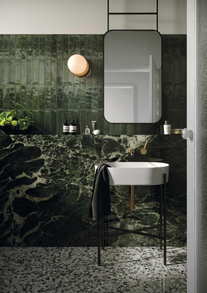
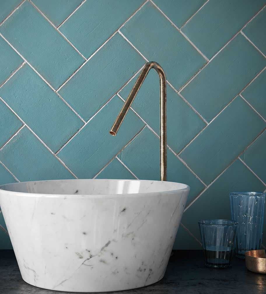
Then the 2021 trends will also influence the ceramic tiles, so we will have many choices similar to natural stone, especially in warm colors. In fact, this year in tiles, the dominant neutral colors are beiges and ivories.
Then, in the brighter colors, several deep greens, inspired by the foliage will be present everywhere. The plain green glossy tile in rectangular format will be very popular for bathroom tiles or kitchen backsplashes! Beware, you will even find green marble effect tiles! It is absolutely ideal for making a spectacular powder room.
Red and orange are making a comeback in tiles, but in soft shades such as pink peach or clay.
As for the most popular formats, we will find squares and rectangles, both in small and very large formats. A return to imperfect tiles is a trend we’re seeing more and more; they are textured and irregularly cut to mimic a handmade cut.
Trends are good, but at the end of the day, I have to listen to my clients because my goal is to create a decor that reflects their image and gives them more well-being in their daily life, according to their own needs and lifestyle. Because I deeply believe that everyone deserves a home that looks like them and where it feels good to live.
To conclude, there is no one color of the year, so go with your personality to decorate your home.